Physical Marketing Materials for Aureole
I created a range of materials.
When I first started working with Aureole Music, a charity which provides free singing sessions in care settings across Jersey, as well as singing sessions for people with Parkinson’s and their families, they had very little brand identity.
They had three logos, one for Aureole, one for Monday Melodies (their singing in care-settings arm) and Sparky Parkies (their singing sessions for people with Parkinson’s and their families). They also had a website, but they had no set brand fonts or colours, no t-shirts, banners or leaflets.
Their logos
The overall charity logo.
The logo for their work in partnership with Parkinson’s UK
The logo for their work in care settings.
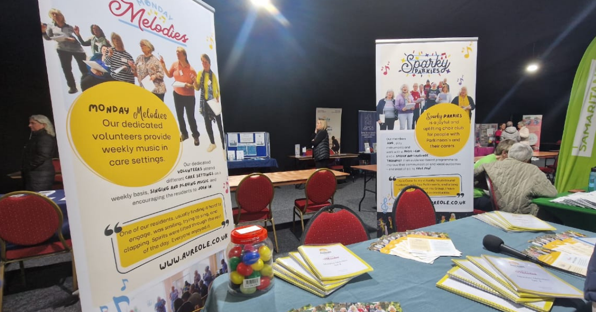
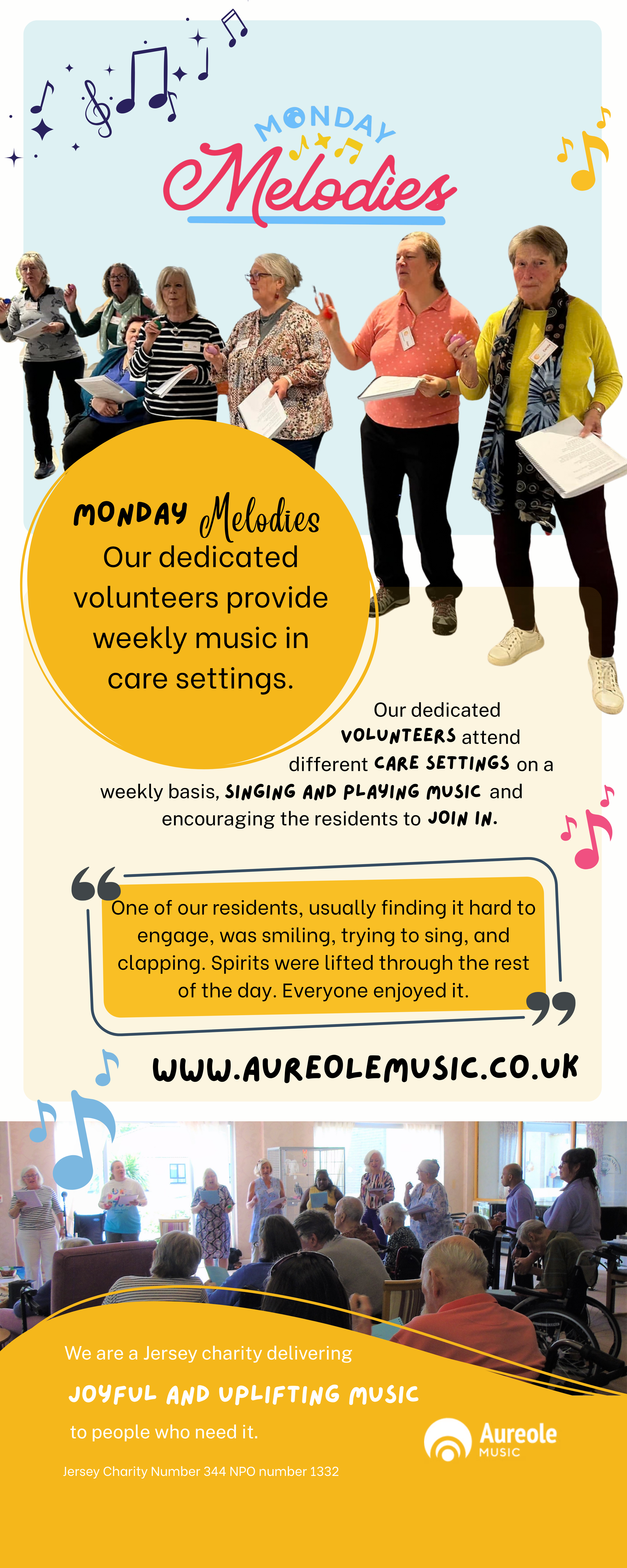
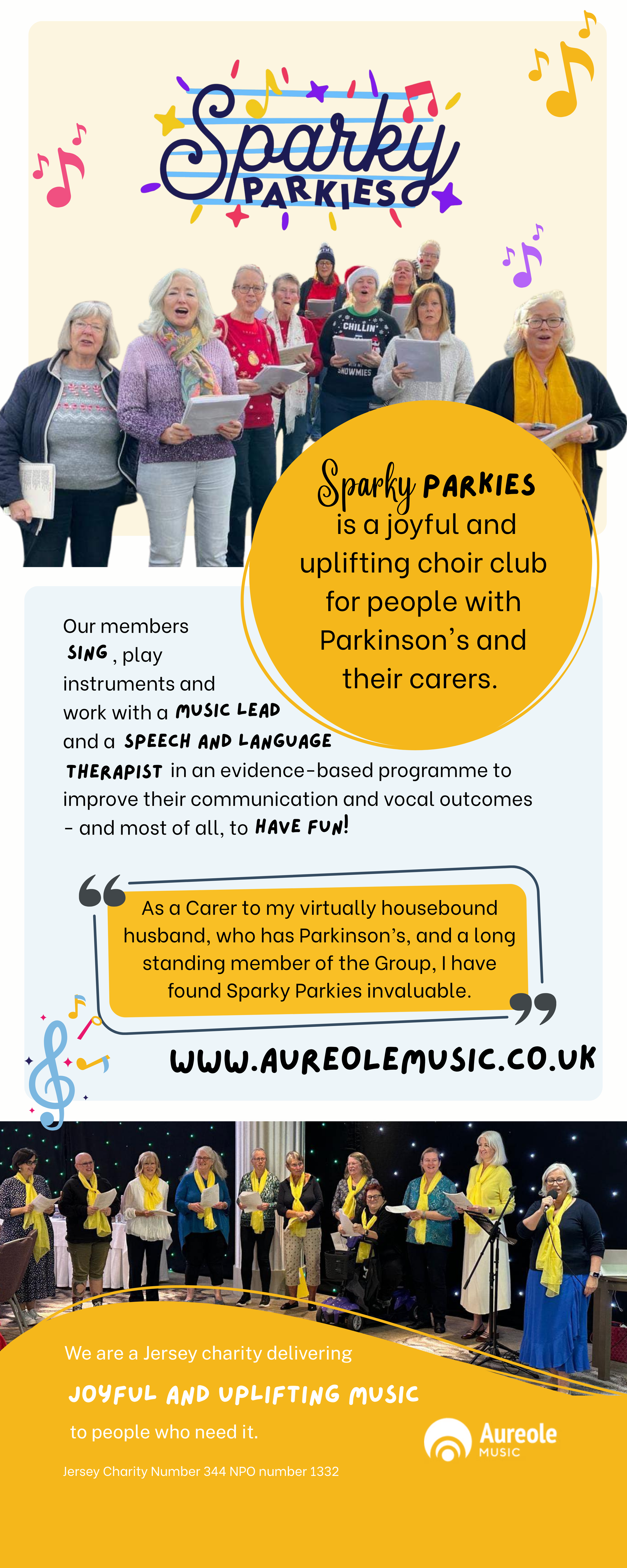
The Roller Banners
-
These banners were needed for primarily indoor events, where audiences were unfamiliar with the charity’s work.
-
This was the first item I needed to create with very little branded items to work with.
I decided to draw out the yellow and rings from the Aureole main logo and use this to highlight sections of text.
I took colours from the Sparky Parkies and Monday Melodies logos and put them in pastels to create subtle backgrounds.
I also took fonts from the logos to add some visual interest alongside a sans serif font for clarity and readability.
Finally I lifted some of the musical notes elements from the logos and scattered them across the page for a bit more interest.
-
Whilst I wanted the banners to be unique in colour, images and information, I wanted them to be uniform in design.
With roller banners the most important information is in the centre, with the next most important at the top, and the least at the bottom. That’s why the description, quote and web address is close to the centre.
In Jersey, it’s a fairly tight-night community, so having familiar faces in photos can draw more people in. So the photos at the top of the page serve as more than just visual interest.
The information at the bottom of the banner is there to really give context and centre the charity, for people who are interested enough to get close to the banner and really look for the information. Not only does it give key information, it links both Sparky Parkies and Monday Melodies under the Aureole logo.
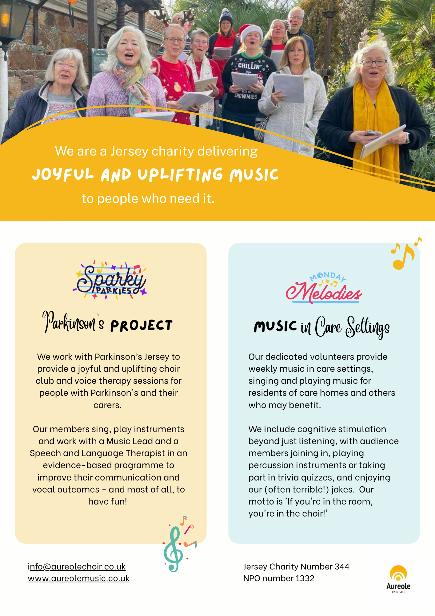
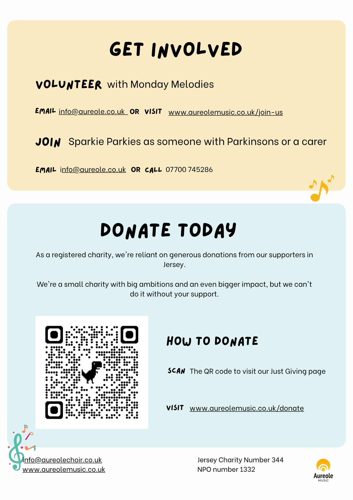
The flyer
-
These leaflets were primarily for providing information about what Aureole as a whole does, as well as persuading people to get involved or donate. It’s a double sided A4 flyer that could easily be pinned to a board at a workplace or town hall, as well as being laid out on tables for events. Both sides make sense independently.
-
Most of the brand elements were lifted from the work I did on the banners (see above).
The main difference with this work was centering Aureole as the overall brand, with Sparky Parkies and Monday Melodies as clear sub brands with different purposes.
For this reason, Aureole and it’s colours feature at the very top of the leaflet, with the parallel sections for either sub-brand.
-
There was a lot of information to fit onto on double sided A4 banner, so layout was key.
I used the pastel brand colours to create clear sections for different bits of text. It made sense to use the front to explain the purpose of the charity, and the back to persuade people to donate and get involved.
The banner also needed to be optimised for digital use, as it is occaisionally emailed out to prospective corporate sponsors so the links also needed to work well.
The t-shirts
-
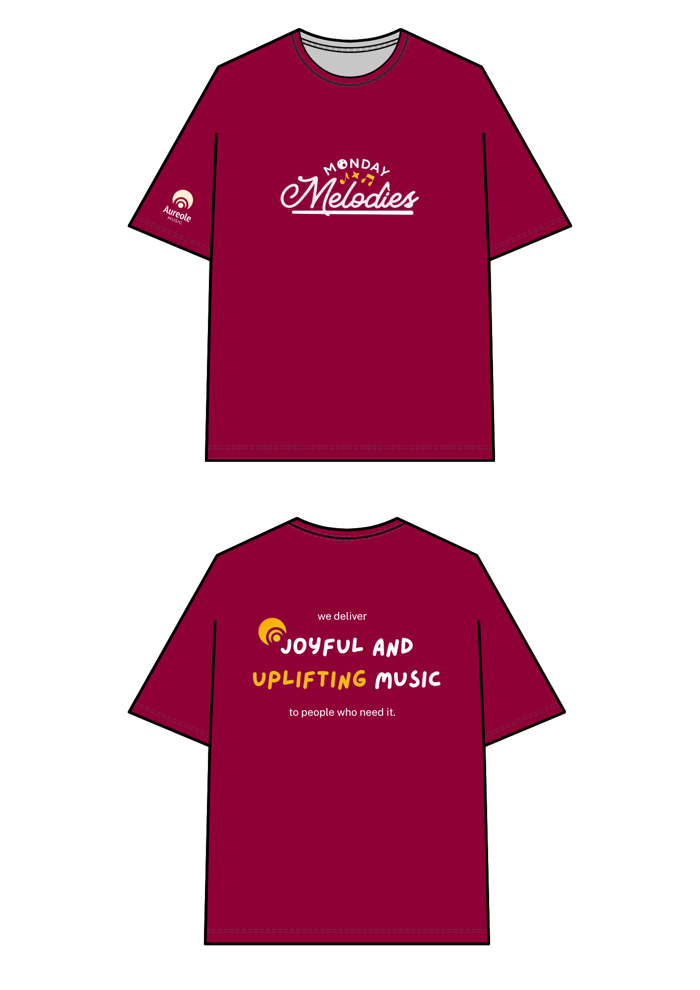
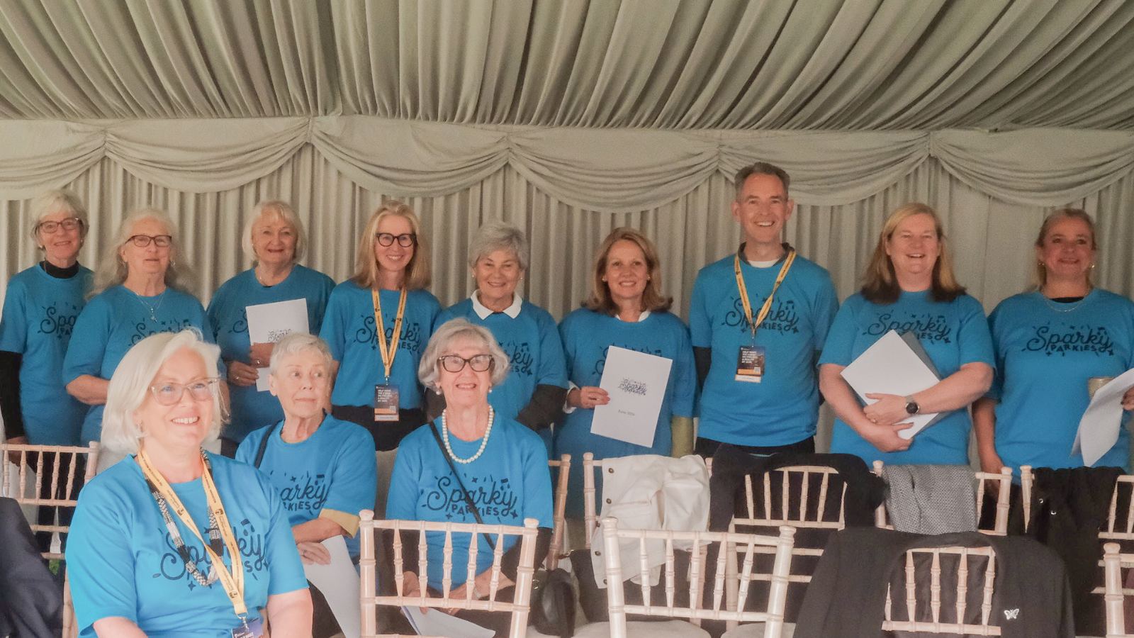
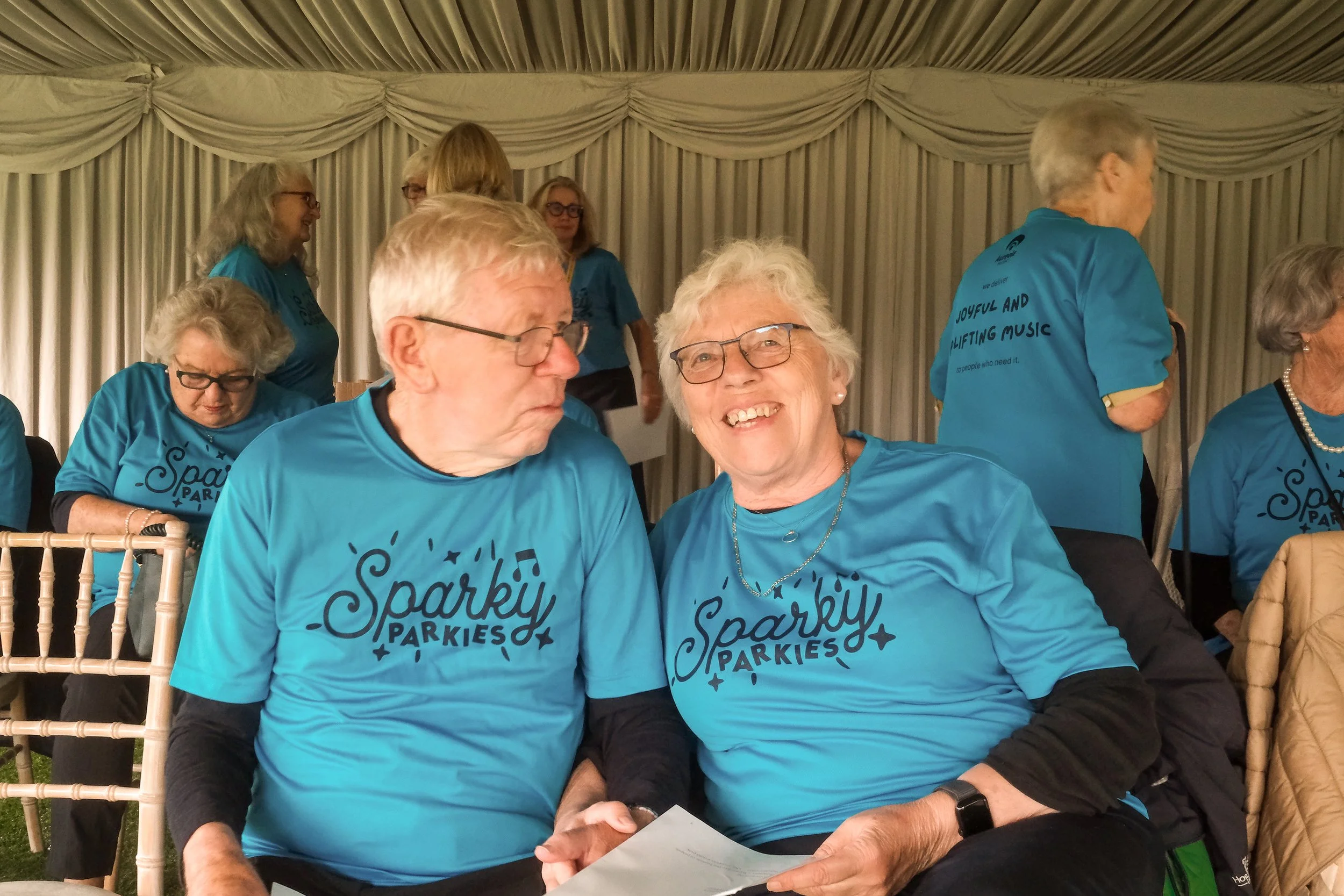
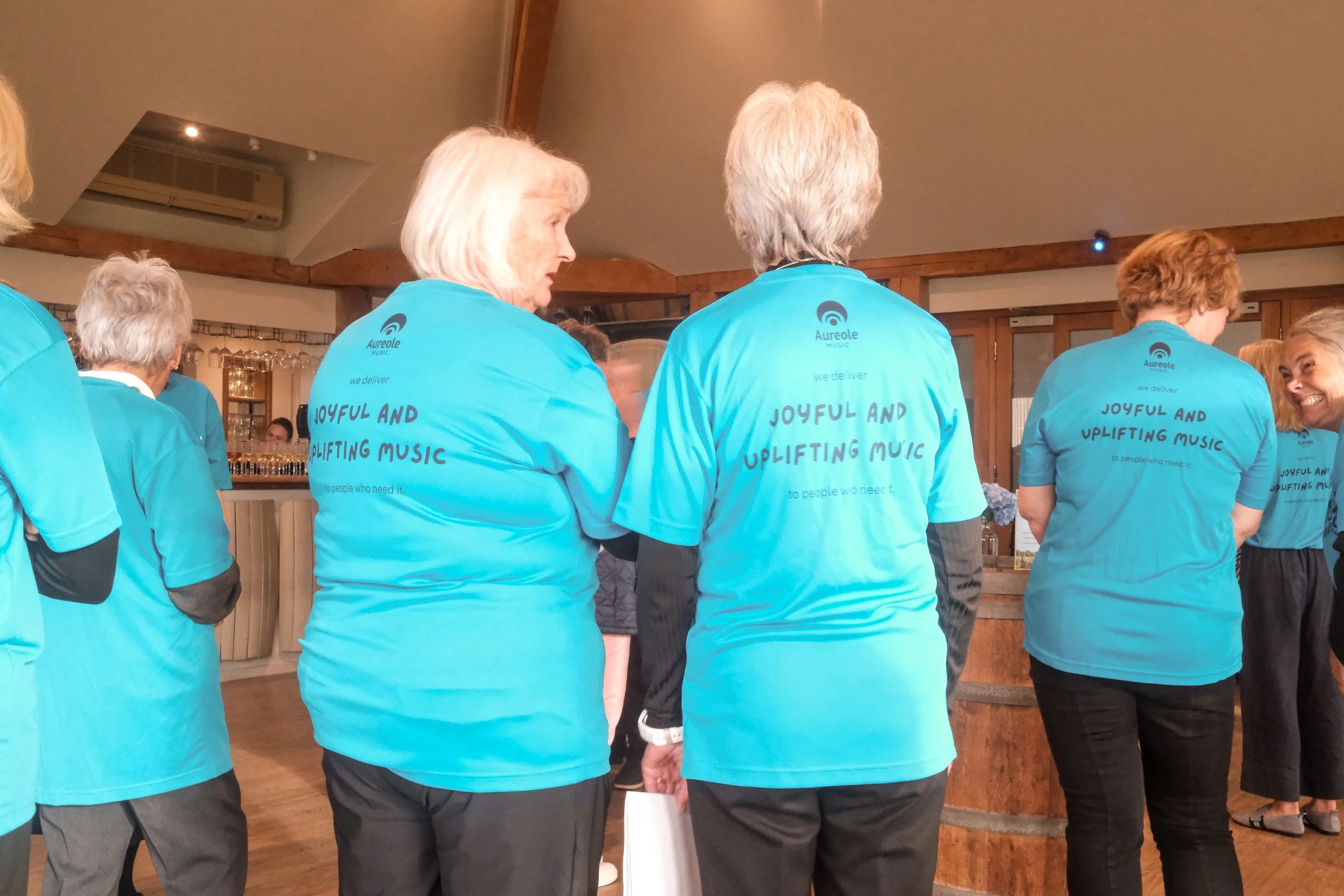
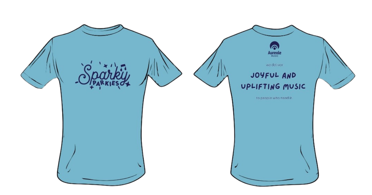
The charity wanted two different kinds of t-shirts, one for Sparky Parkies and one for Monday Melodies, in a range of sizes
-
Initially I recommended more use of the Aureole yellow, however participants and volunteers were reluctant to wear such a bright colour.
Instead we went with two different colours for the two artms of the charities, highlighting the Aureole slogan and logo on the back.
In order to accomodate the chosen colour of the tshirt, the Monday Melodies logo colours had to be inverted.
-
Initially, we wanted the Sparky Parkies to have it’s text in white with the yellow highlights (similar to the Monday Melodies ones), however they had an important event coming up, and this printing option wasn’t available on the island at such short notice, so instead it was put in a simple navy blue instead.